Graphic Design, Branding, Packaging Design
Wesley Snacks
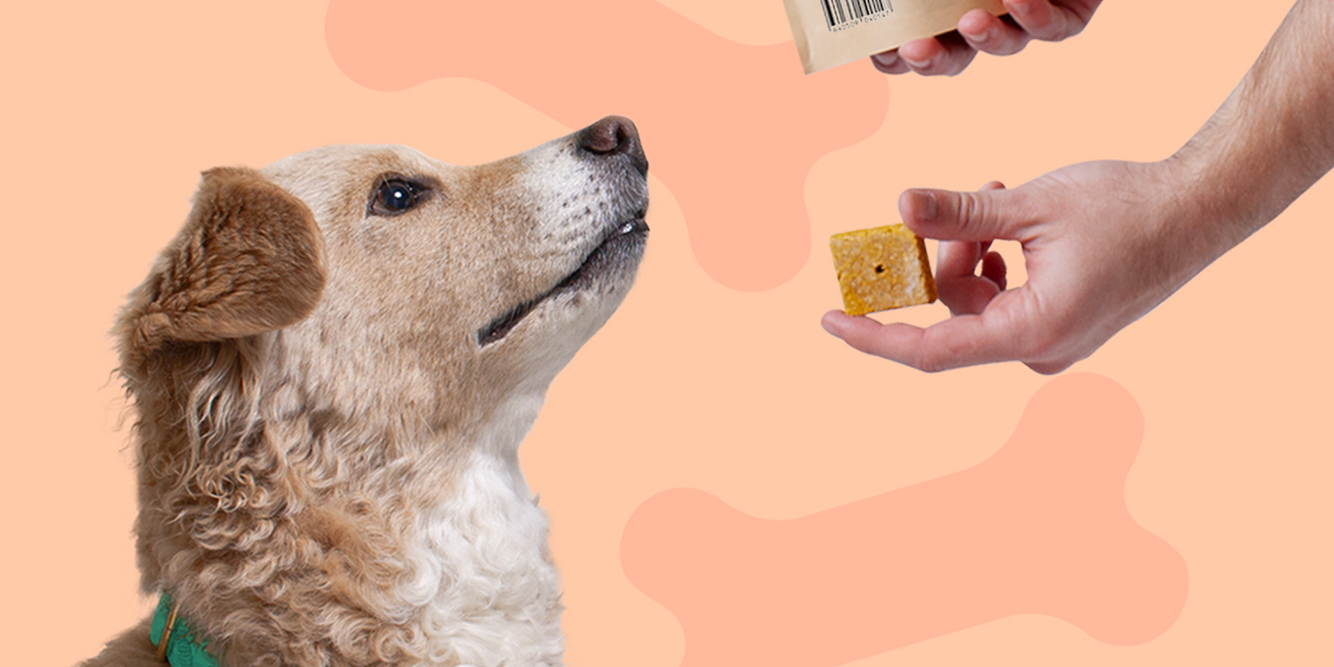
Wesley Snacks began as an experiment in looking for the best biscuit for our four-legged friend. Inspired by the lack of dog treats with minimal, easy to pronounce ingredients, Wesley Snacks aims to be the healthy alternative to traditional empty-calorie treats.
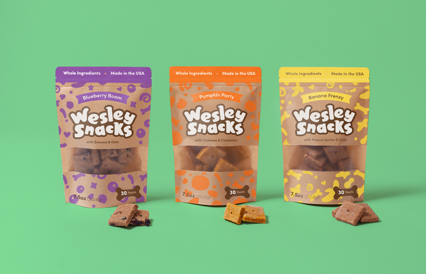
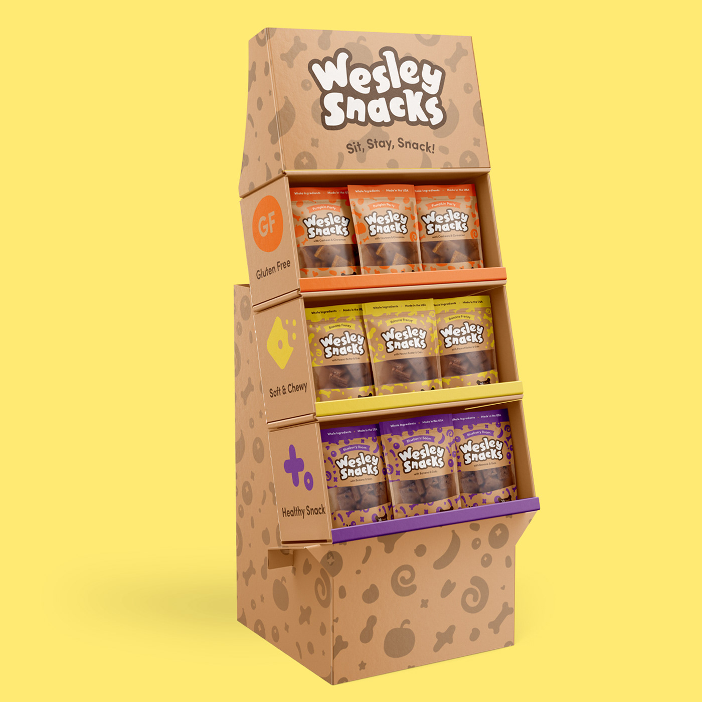
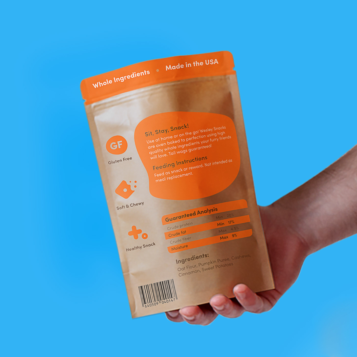
To stand out amongst the pack of different treats, we used the bright, vibrant colors of our main ingredients as a guide to distinguish between each flavor and create a whimsical, differentiating pattern. Paired with a neutral substrate these patterns and large bubbly logotype really pop off the shelves. The back of the package includes icons that highlight the best features of Wesley Snacks and provides another layer of trust in the ingredients. To help dog owners make the best decision for their BFF (Best Fur Friend) we were proactive in keeping the top ingredients front and center. In addition, a large window was included for consumers to see the size, texture and weight of the snack before purchase. Clean rounded typography helped create clear navigation.
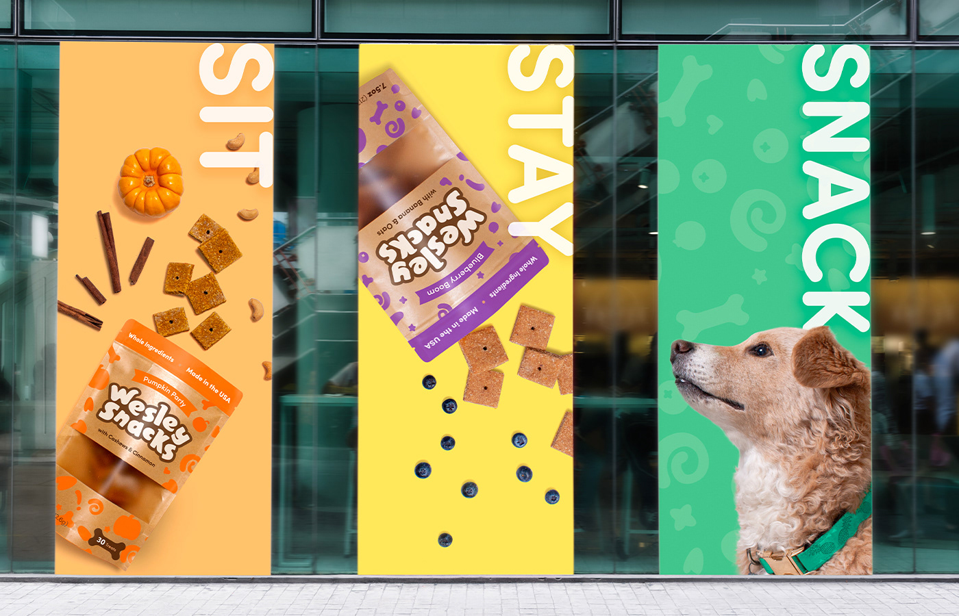
The result is a successful brand and identity design that promotes health, trust and whimsy. Sit, Stay, Snack with Wesley Snacks! This project was done with my partner Antonio Mustico.